The role of colour in painting: from symbolism to artistic revolution
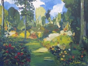
Colour is far more than a visual element on a canvas. It is language, emotion, symbol and history. From the frescoes of Antiquity to the most radical abstractions of the twentieth century, painters have made colour their most powerful tool for reaching the eye and moving the soul. This article invites you to explore the evolution of colour in painting, its universal meanings, and the way a handful of major artists elevated it into a subject in its own right.
The symbolism of colours: a universal language
Before a viewer even understands a composition, they feel the colour. This reaction is both cultural and deeply human, and certain associations have persisted across centuries and civilisations.
Red embodies passion, danger and vitality — it draws the eye and quickens the pulse. Blue, the colour of sky and water, evokes calm, depth and gentle melancholy. Yellow radiates energy and light, though it can tip into unease depending on its context. Green speaks of nature, hope and balance. Black, long associated with mourning in the West, becomes in other artists' hands a synonym for absolute elegance or fertile mystery. White, by contrast, embodies purity, silence and infinite space.
These meanings are never fixed. A red laid over a black ground speaks differently from the same red on a white canvas. This is the magic of painting: colour never means anything alone.
The great evolution of the palette through the centuries
For centuries, painters were limited by the availability of pigments. Deep blues — such as lapis lazuli — were more precious than gold and reserved for the noblest subjects: the Virgin Mary, divine heavens. Ochres and natural earths dominated medieval palettes, not by choice but by necessity.
The Renaissance introduced a new relationship with light through Leonardo's chiaroscuro and sfumato. Colour became a modelling tool, in service of the illusion of depth. Titian and the Venetians already sensed that colour could be as important as drawing.
Everything changed in the nineteenth century with the industrial pigment revolution. Prussian blue (1704), zinc white, chrome yellow, then synthetic vermillion and artificial ultramarines opened up unprecedented possibilities. The Impressionists immediately seized this new freedom: their canvases burst with pure tones placed side by side, leaving the viewer's eye to mix the colours — this is colour division.
The invention of the paint tube in 1841 was a quiet but decisive revolution: the artist could now paint outdoors, facing natural light. Monet, Renoir and Pissarro transformed this freedom into doctrine.
Matisse and the Fauves: colour set free
In 1905, the Paris Salon d'Automne caused a scandal. A critic ironically dubbed "wild beasts" — fauves — the painters exhibiting canvases of violent, non-naturalistic colours applied with apparent freedom. Henri Matisse was their central figure.
For Matisse, colour was no longer there to describe reality — it was reality. In Woman with a Hat (1905), his wife's face is streaked with greens, reds and violets. This is not a faithful portrait: it is an explosion of sensations. Matisse himself said that colour must produce an emotional shock before any reasoning takes place.
Van Gogh, a precursor of Fauvism, had already taken that step. In his Sunflowers or The Starry Night, yellow vibrates with an almost painful intensity. The colours do not describe light: they are light, carried to their expressive peak. Van Gogh used complementary pairs — blue and orange, yellow and violet — not to balance but to create a vibrant, almost audible tension.
Emil Nolde, the German Expressionist, pushed this emotional dimension still further. His religious canvases, with their violent reds and greens, radiate a raw, almost hallucinatory spirituality. For Nolde, colour does not beautify — it reveals.
Pure colour: monochrome and abstraction
In abstract painting, colour is no longer in service of a subject — it becomes the subject. Some artists took this logic to its absolute conclusion: the monochrome.
Yves Klein and his famous International Klein Blue (IKB) represent the most radical example: a single colour, a single format, a single vibration. The monochrome is not an impoverishment — it is an invitation to total contemplation, free from narrative distraction.
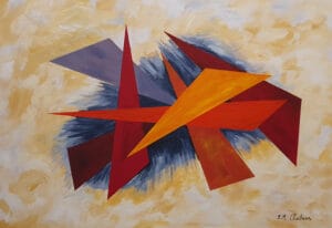
Serge Poliakoff, whose work has profoundly influenced my own pictorial approach, embodies a different path. His compositions bring together flat areas of warm and cool colours in subtle equilibrium. Each coloured form seems to breathe against its neighbours. There is no simulated depth, no perspective: only chromatic relationships that create a powerful inner harmony. In Poliakoff's work, colour thinks.
Mark Rothko, meanwhile, envelops the viewer in fields of luminous, almost immaterial colour. His large formats are designed to be seen up close, so that colour becomes a physical, meditative experience.
Contemporary trends: between saturation and restraint
Contemporary art maintains an ambivalent relationship with colour. Some artists explore the extremes of saturation — fluorescent hues inherited from pop culture and the digital world. Others, by contrast, return to earthy, minimalist, almost archaeological palettes, as if reacting against the visual overstimulation of modern life.
In current figurative painting, the deliberate use of non-naturalistic colour has established itself as a hard-won freedom. A portrait with blue skin tones or a landscape under green skies no longer surprises: it is the mark of a personal gaze, an asserted sensibility.
Colour as emotion: what the collector feels
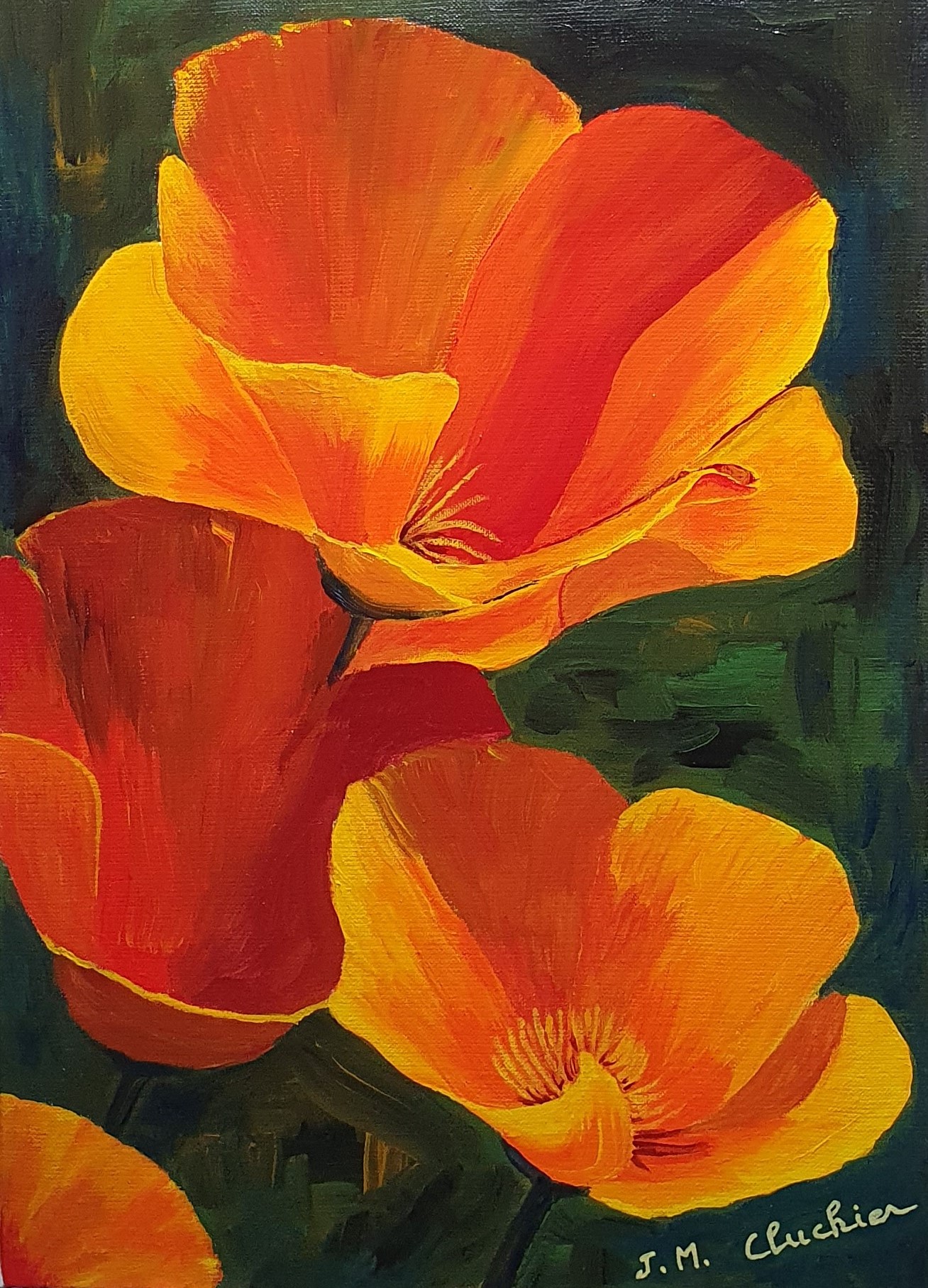
Standing before a canvas, the collector often reacts to colour before they even understand the subject. It is this primitive, instinctive reaction that creates the coup de cœur — the instant connection. A warm, luminous palette can bring joy into an interior; a dark, contrasted one will install a strong, almost dramatic presence.
Choosing a work of art means choosing a colour you are willing to live with. Experienced collectors know this well: a painting that stays with you over time is often one whose colour continues to speak to you differently, depending on the hour and the quality of the light.
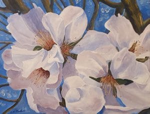
Explore my original works at cluchier-art.com and let your own chromatic sensibility be your guide.